


Logo Guidelines
Consistent usage of the logo is essential to creating a distinct brand presence. Inspiration for the logo is derived from the University’s mission to inspire innovative, service-based learning in and out of the classroom, as well as from the visual heritage of the University, its namesake and the broader Catholic and Celtic aesthetic. To communicate that sentiment, we have combined modern elements with a hint of tradition, allowing us to evolve while staying true to our heritage. Visual inspirations include:
- Iona University Seal and Culture
- Traditional Iona Cross
- The Plaid Pattern Worn by our Pipe Band
- Ancient Celtic Knots, Including Solomon’s Knot
- The Story of St. Columba
- Iona Abbey on the Isle of Iona
The Celtic knot cross icon serves as a building block—both graphically and in a grander sense in that it represents our institution’s sense of unity, purpose and service. The color palette of the logo is also used to illustrate our commitment to being a forward-thinking university defined by our unique approach to education.
The line work in the brand logo and patterns is also a visual nod to our “Learn Outside the Lines” brand position. The intermingling lines in the logo represent core values of our University: Spiritual Grounding, Equity, Inclusion and Community. But Iona is also a place where you are challenged to “Learn Outside the Lines.” To learn in a new way. Outside of the classroom, outside of expectations, and outside of your comfort zone.
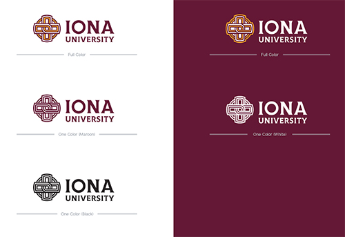
Our primary University mark consists of the Celtic knot icon paired in a horizontal lockup with a stacked variation of the University wordmark. When possible, use the full color version of this logo. When the full color version is not applicable (i.e. screen printing or layered vinyl graphics), the one color maroon version is recommended.
These examples showcase the proper color usage when placing our primary University mark in one color on both light and dark backgrounds.
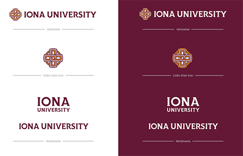
The alternative secondary Iona University logo set consists of a horizontal version with all elements, and the elements themselves separated out by Celtic knot icon and wordmark. These marks can be used in the same color sets as the primary University mark: full color and individual one color maroon and black.
Do not crop the wordmark from the primary University mark. When standing on its own, the wordmark should consist of IONA UNIVERSITY from the alternative horizontal University mark.
Do not add text or other images on top of the Celtic Knot.
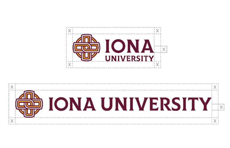
When using the University marks, be sure to provide clear space to ensure uninterrupted readability. With the primary University mark, the recommended amount of clear space should be equal to half the height of the letter A in IONA, and with the alternative horizontal University mark, the clear space should be equal to half the height of the letter E in UNIVERSITY.
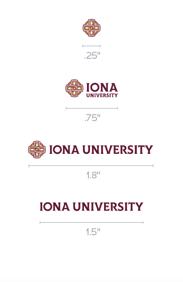
To ensure legibility of all elements on physical objects, the Celtic knot icon should never be reproduced at sizes smaller than a quarter of an inch (.25) wide. The primary University mark should never be reproduced at sizes smaller than three-quarters of an inch (.75) wide. The alternative horizontal University mark should never be reproduced at sizes smaller than one and a half inches (1.5) wide. When a size smaller is necessary for the primary and alternative University marks, use the wordmark at a size down to one and a quarter inches (1.25) wide instead.
When sizing the University mark for digital use, the shortest side should be 500px or larger.
In particular instances, the Iona University logo may be placed on full-bleed imagery. Position the logo over solid contrasting areas within the image. Use photography that does not compete with the legibility of the logo.
Do not place any logo over an image, texture, or pattern that diminishes the prominence or legibility of the logo.
Be selective about where and when the logo is used against imagery or photography. If you’re unsure about using the logo over a photo, please contact the Iona University Department of Marketing.
Proper use of the Iona University logo will ensure a strong, successful brand. Please refrain from using old and non-approved logos.
Do not apply a stroke to the logo. • Do not add a drop shadow to the logo. • Do not rotate the logo. • Do not stretch the logo. • Utilize only the approved wordmark when used on its own. • Do not use previous logos. • Do not adjust the colors of the logo. • Do not alter the proportions of the logo. • Do not use unapproved lockups. • *Do not place within a curved or irregular shape. • Do not add text or other images on top of the Celtic Knot.
*Some special cases may be exempt from this rule. For additional guidelines, please contact University Marketing & Communications.
The Iona University logo is the most vital and visible component of our brand. It is imperative the main logo, and every one of the logos in the Iona University family, be used with consistency and care.
The Iona University logos included in the family fall into one of several categories, all of which are detailed within this guide.
Each of the logo sets within the family have their own standards and rules for use. Please follow these rules whenever using logos in marketing and promotional materials.
Together, this family of logos creates a singular brand, allowing Iona University and its many schools and organizations to function as one.
If you have any questions about the family of logos or proper logo usage, please contact University Marketing & Communications.
LOGO GUIDELINES
Primary Logo

Individual Logos
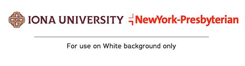
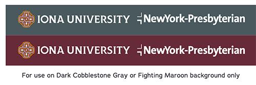
Iona University and NewYork-Presbyterian Individual Logos can be used on white, Dark Cobblestone Gray or Fighting Maroon backgrounds only.
Example use on white background.
Example use on Dark Cobblestone Gray and Fighting Maroon backgrounds.
Background Misuse
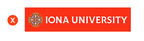
Do not use Iona logos on NewYork-Presbyterian brand red.
Do not use NewYork-Presbyterian brand red on our Iona brand maroon. Use the white logo options for NewYork-Presbyterian instead.

SCHOOL NAME GUIDELINES
The official school name* should be written out as:
There is no space between "NewYork."**
If the school name is too long to fit, Iona should always be placed on a separate line from NewYork-Presbyterian:
*PLEASE NOTE: These guidelines do not apply when written out in a document or in a body of text.
**"NewYork" does not have a space, regardless of where it is written.
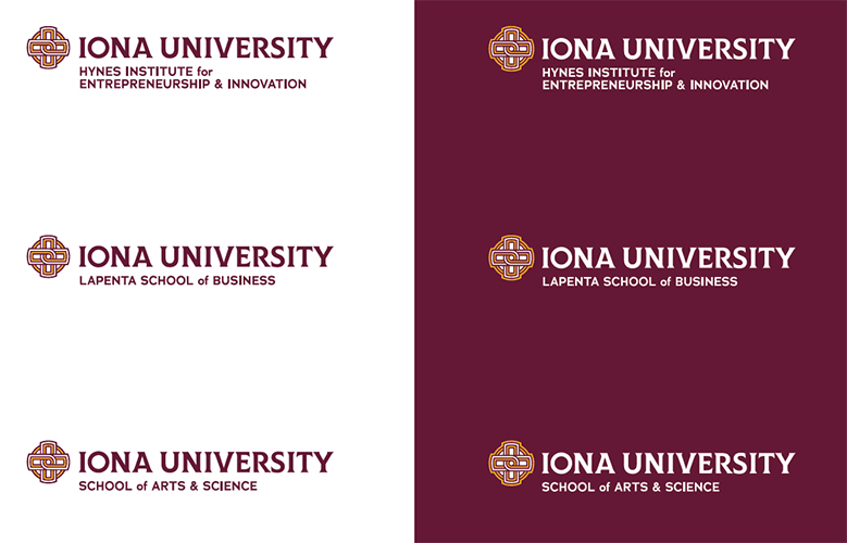
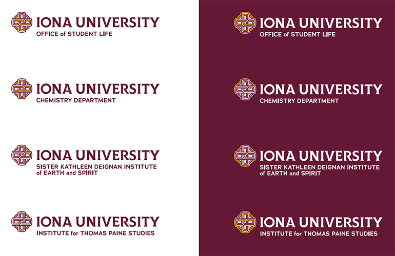
To maintain consistency across our entire University, our individual school logos will follow a similar structure to the alternative horizontal University mark with the exception of the modifier which will reflect the school itself. These modifiers will match the maroon color of the alternative horizontal University mark, but use the secondary headline typeface, Adrianna Demibold. These marks can be used in the same color sets as the University mark: full color, individual single primary colors and black.
These logos should not be used in conjunction with the primary or alternative University marks as they are similar in design and would create redundancy between the two with duplication of icon and IONA UNIVERSITY.
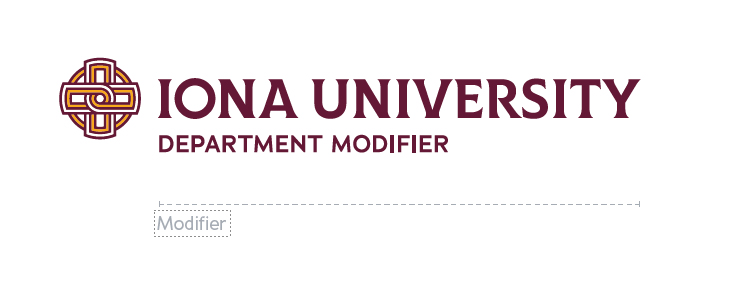
As with our school marks, the department marks will reflect the horizontal primary University mark, with an updated modifier. The modifier can run the full length of the IONA UNIVERSITY type and should become two lines of type when the modifier is longer. These marks are not to be used with the primary University mark, as doing so would yield a duplication of the Celtic knot icon and IONA UNIVERSITY.
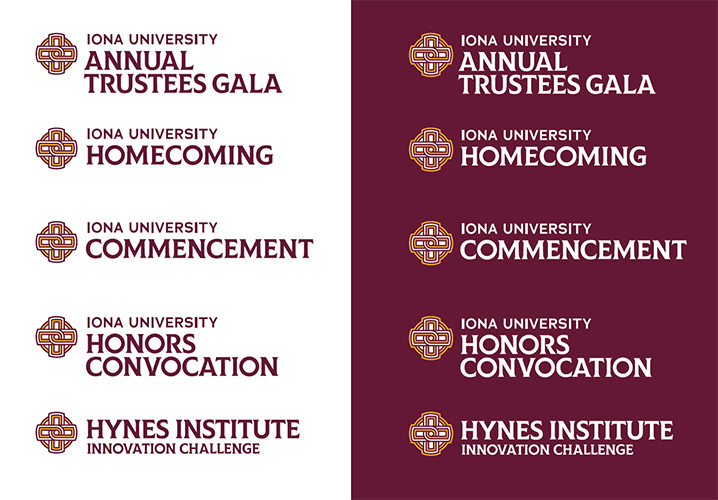
Similar to our department and school marks, University events can use the equity of the design elements of the primary and alternative University marks. In these unique cases, the name of the University event will take the place of the IONA UNIVERSITY name of the primary University mark, while the IONA UNIVERSITY name will become a modifier above it. The primary University mark can be modified only in these rare instances.
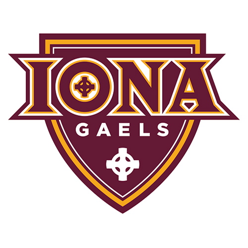
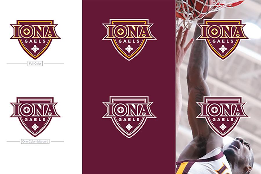
The symbol of Iona University’s athletic teams is the Gael. The Gaels were an ancient and accomplished culture originating in Ireland. Known for their tight-knit clans, unique athletic games and adventurous spirit, their influence is still seen today throughout Ireland, Scotland and beyond. Like the founding traditions of Iona University, the Gael personifies the strength and selfless devotion of the school motto, “fight the good fight” (certa bonum certamen). Like the school motto, the Iona Gaels Shield Logo personifies the strength and unity of our athletics teams. The following examples show proper use and application of the Gaels Athletics Mark.
Iona University participates in a licensing program that oversees use of our trademarks on a variety of items and works to promote, enhance, and elevate the image of Iona by authorizing the use of our name and logos on high quality and tasteful merchandise.
If you have questions about how and when you can use the Gaels Athletics Mark, please contact Iona University Athletics Communications.
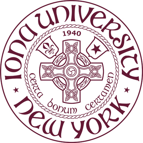
The Iona University seal is used for multiple applications, but its main purpose is to represent more official and formal communications. Using the seal is the fastest way to communicate the prestige of our University. However, the seal should only be used when appropriate
The following examples show proper and improper use and application of the Iona University seal. If you have questions about how and when to use the seal, please contact University Marketing & Communications.

In addition to the brand marketing elements throughout this guide, Iona University has legacy emblems with tremendous equity and lasting bonds to the school’s heritage. While an enduring part of the Iona story, these emblems should be used judiciously to avoid confusion with other marketing efforts.
Presidential Seal
An abiding symbol of Iona University’s heritage and identity, the Presidential Seal is a venerated emblem embodying the school’s foundational elements. It represents Iona’s establishment, motto, community, values, and origins from St. Columba to the legacy of Blessed Edmund Rice and the Christian Brothers.
To maintain its prestige, the Presidential Seal is reserved for formal institutional communications and should only be used with the approval of the president.
Back to Homepage • Who We Are • Our Brand
Logos • Color, Font & Graphics • Apparel & Gear
Photography • Editorial Standards • Download Brand Assets & Templates